Multi-select Token Control
Description
The Multi-select Token control is a dropdown control with an auto-complete list that inserts tokens that can be removed by clicking an 'x' button on the token or using the delete or backspace key on the keyboard.
Discussion
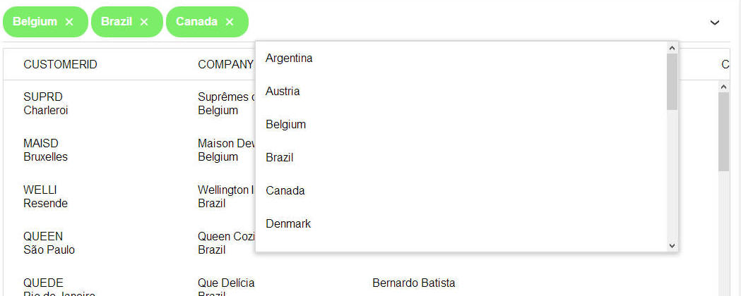
The Multi-select Token control is similar to the Edit-combo control and the Auto-suggest control. However, the selected values are displayed as 'tokens' (as shown in the image below where 'Belgium', 'Brazil' and 'Canada' are selected). A selected value can be removed by clicking on the 'x' icon in the token.

The user can select values from a pick list as shown in the image below. The pick-list is automatically displayed when the user types in the input control or clicks on the optional down arrow. The user can insert a token by selecting a choice from the dropdown or by typing the value into the control and then pressing the Enter key.
Tokens are removed by clicking the 'x' icon or by placing the cursor after a token and using the Backspace key.
The choices for the pick-list can be statically defined as a fixed list of options or dynamically populated using a SQL query or Xbasic function.
How to Add a Multi-select Token Control to a UX Component
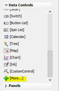
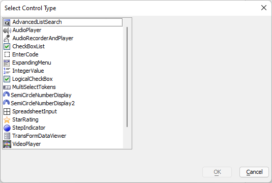
To add a Multi-select Token control to a UX component, select the [More...] item in the Data Controls section of the UX toolbox.
The Multi-select Token control is a Data Control. This means it can be used with the UX Component's .getValue() and a .setValue() methods. When the UX component is submitted, the Multi-select Token control's value is submitted as a comma delimited list of values.
For example, if there are three tokens selected with values of 'USA', 'UK' and 'Canada', the value submitted is 'USA,UK,Canada'.
To set the value in a Multi-select Token control, the values must be specified as an array. For example:
{dialog.object}.setValue('MY_MULTISELECT_TOKEN_CONTROL',['USA','UK','Canada']);Setting the Multi-Select Token Control Properties
To set the properties of a Multi-select Token control, click the  smart field button for the Control properties property in the Property sheet.
The configuration genie window is displayed, as shown below:
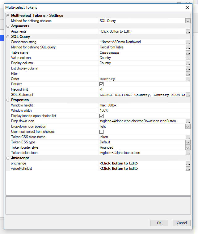
Method for defining choices
The Method for defining choices specifies how the data for the choices displayed by the control are obtained. Choices can be specified as a static list of choices, a SQL query, or an Xbasic function. The SQL query can be the name of a table in a database or a custom SQL statement (such as a call to a stored procedure.)
If the FieldsFromTable option is used, two columns from the table must be selected to define the display value and stored value. The first column (Value column) defines the value for the selected token. The second column (Display column) is the value shown in the input control for the Token. An optional 3rd column can also be selected - List Display column. This property defines the display value shown in the choice list. The Display property of each choice will be used if no List Display column is specified.
The query for a SQL statement must return a result set with either 2 or 3 columns. The first column must have a name of 'value', the second column must have a name of 'display' and the optional 3rd column must have a name of 'listDisplay'. For example:
SELECT contactname as value, customerId as display from Customers
Display icon to open choice list
When the user begins to type in the control, the choice list is opened and is filtered on the text the user has typed. This is similar to how an auto-suggest control works. The Display icon to open choice list option controls whether or not an icon to open the choice list is shown. The icon can be displayed on the left or right side of the input control.
User must select from choices
If un-checked, the user can type in any value into the control. When the user presses Enter, the text the user has typed is added to the token list. If this property is checked, if the user types in a value and then presses Enter and the text the user has typed is not in the choice list (i.e. is not the value property for one of the choices in the list), a new token is not added.
Icons
The icons used to display the choice list and to delete a previously selected token can be customized using the Icons property. The Multi-select Token control only supports using SVG icons.
Token CSS type
The Token CSS type property can be used to customize the appearance of the selected tokens. The Token CSS type can either be set to Default or Custom. If Default is selected, tokens can be configured to have a square or round border using the Token border style property. In the images above, the border style has been set to rounded.
onChange
The onChange event can be used to execute JavaScript code when the value in the control changes. This event will fire each time the user makes a selection from the choice list to select a new token, or when the user types in the value of a new token and presses Enter. Values are stored in the order they are added to the control.
The following variables are available in the onChange event:
- this
A pointer to the ViewBox control used to implement the Mutlti-select Token Control.
- this.value
An array containing all of the selections in the control. The last value in the list is always the most recent token added.
// Display the choices in a popup window for a multi-select token
// control that displays and stores different values.

var selected = this.value;
var choices = [];

for (const choice in selected) {
    var currValue = selected[choice];
    var productName = "";

    productName = this.getDisplayValue(currValue);

    if (productName) {
        choices.push(productName);
    }
}

// Dislpay selected choices as bullet list in popup message:
choices = choices.join("</li><li>");
var msg = '<p style="max-width:300px;">User has selected the following choices:</p><ul><li>' + choices + "</li></ul>";
A5.msgBox.show("Selected Choices",msg,"o");
valueNotInList
The valueNotInList event can be used to execute JavaScript code when the user enters a value that is not in the list of choices. This property is only shown if the User must select from choices property is unchecked. If the user types in a value that in is not in the list of choices, the code defined for this event will execute. This event can be used to add the value to a database.
The following variables are available in the valueNotInList event:
- val
The value the user typed into the control.
- ci
A pointer to the ViewBox control used to implement the Mutlti-select Token Control.
For example, the code below makes an ajax callback to the server, passing the value that was not in the list to the function as the parameter "newProduct". A5.ajax.buildURLParam() is used to create the URL parameter to pass the data to the callback:
// Create parameter to pass to callback.
var parameters = A5.ajax.buildURLParam("newProduct",val)

// Do an Ajax Callback to the server to add the new product
{dialog.object}.ajaxCallback("","","addNewProduct","",parameters);
The addNewProduct() callback function does the work of adding the new value to the Products table and returning JavaScript to the client to update the Multi-select token control. In the callback function, shown below, the sql_insert() Xbasic function is used to add the new product to the Products table in the Northwind database:
function addNewProduct AS C (e AS P)
    dim js as c = ""

    if (variable_exists("e.newProduct")) then
        dim result as P
        dim record as P
        record.ProductName = e.newProduct
        dim recordJSON as C
        recordJSON = json_generate(record);

        '' Add new product to Products database.
        result = sql_insert("::Name::AADemo-Northwind","Products",recordJSON);

        if (result.error) then
            '' Error: Unable to add product
            js = "alert('Could not insert new product, " + js_escape(e.newProduct) + ". Error was: " + js_escape(result.errorText) + ".');"
        else
            '' Success: Call repopulateProducts to update the list of choices for the control
            js = js + "var productName = '"+js_escape(e.newProduct)+"';"
            js = js + "var productValue = '"+js_escape(result.lastInsertedIdentity) + "';"
            js = js + "repopulateProducts(productName, productValue);"
        end if
    else
        '' Error: You didn't pass in newProduct=value to the callback function
        js = "alert('New product was not submitted to callback.');"
    end if

    return js
end function
If the product is succesfully added to the Products table, the addNewProducts() callback function returns JavaScript to call the repopulateProducts function on the client to update the Multi-select token control with the new value.
The repopulateProducts() JavaScript function is shown below:
var repopulateProducts = function(productName,productValue) {
    var currentValue = [].concat({dialog.object}.getValue("MULTISELECTTOKENS"));
    var vobj = {dialog.object}.getControl("MULTISELECTTOKENS");
    if (vobj) {
        // Add the new option to the list of choices for the multi-select token control

        // Get the existing data from the current control (Only need to add an entry)
        // List of choices is stored in the data.data property of the control's JS object:
        var data = vobj.data.data;

        // Add the new entry:
        var newProduct = {"value":productValue,"display":productName};
        data.push(newProduct);

        // Repopulate the control:
        {dialog.object}.populateMultiSelectTokensControl('MULTISELECTTOKENS',data);


        // Reset the value of the control to use the value added to the database
        for (choice in currentValue) {
            if (currentValue[choice] === productName) {
                currentValue[choice] = productValue;
            }
        }

        // Set the value of the multi-select token control using item
        {dialog.object}.setValue("MULTISELECTTOKENS",currentValue);
        vobj.inputFocus();

        // Display message that token was added:
        var msg = '<p style="width:300px;">New value added to Multi-select Token Choices: ' + productName + "!</p>"
        A5.msgBox.show("New Product Added!",msg,"o");
    }

}
Methods
The following methods are available for the Multi-select Token Control. To call these methods, you need to first get the JavaScript object for the control:
var tokenObj = {dialog.object}.getControl("MULTI_SELECT_TOKEN_CONTROL_NAME");
if (tokenObj) {
    // Success! Object exists and can be used to call methods on the
    // multi-select token control
}
For example:
var tokenObj = {dialog.object}.getControl("MULTISELECTTOKENS");
if (tokenObj) {
    var value = "27"
    var name = tokenObj.getDisplayValue(value);
    alert(name);
}- Method
- Description
- getDisplayValue(value)
Returns the text shown in the multi-select token control for the specified value. This method is useful only when the value shown in the multi-select token control is different from the stored value.
// 27 is the ProductId for "Schoggi Schokolade" in the Northwind Products table.
var value = "27"
var name = tokenObj.getDisplayValue(value);
alert(name);
If the value is not found in the list of choices, getDisplayValue returns the value passed into the function.
- getRealValue(value)
Returns the data stored for the specified value. This method is useful only when the value shown in the multi-select token control is different from the stored value.
var name = "Schoggi Schokolade";
var value = tokenObj.getRealValue(name);
alert(value);
If the value is not found in the list of choices, getRealValue returns the value passed into the function.
- inputFocus(=)
Gives focus to the multi-select token control, placing the insertion point after the last token.
tokenObj.inputFocus();
Dynamically Populating or Repopulating Choices at Runtime
Choices in the Multi-select Token control can be dynamically populated at runtime by calling the control's .populate() method. For example, the following JavaScript will populate the choices for the Multi-Select Token control with an ID of 'MST1':
var _d = {
    "data":[
        {"value" : "Argentina", "display" : "Argentina"},
        {"value" : "Austria", "display" : "Austria"},
        {"value" : "Belgium", "display" : "Belgium"},
        {"value" : "Brazil", "display" : "Brazil"},
        {"value" : "Canada", "display" : "Canada"},
        {"value" : "Denmark", "display" : "Denmark"},
        {"value" : "Finland", "display" : "Finland"},
        {"value" : "France", "display" : "France"},
        {"value" : "Germany", "display" : "Germany"},
        {"value" : "Ireland", "display" : "Ireland"},
        {"value" : "Italy", "display" : "Italy"},
        {"value" : "Mexico", "display" : "Mexico"},
        {"value" : "Norway", "display" : "Norway"},
        {"value" : "Poland", "display" : "Poland"},
        {"value" : "Portugal", "display" : "Portugal"},
        {"value" : "Spain", "display" : "Spain"},
        {"value" : "Sweden", "display" : "Sweden"},
        {"value" : "Switzerland", "display" : "Switzerland"},
        {"value" : "UK", "display" : "UK"},
        {"value" : "USA", "display" : "USA"},
        {"value" : "Venezuela", "display" : "Venezuela"}
    ]
};

var obj = {dialog.object}.getControl('MST1');
obj.populate(_d);
You can alternatively use the {dialog.object}.populateMultiSelectTokensControl() function to repopulate the control:
var data = [
    {"value" : "1", "display" : "Alpha"},
    {"value" : "2", "display" : "Beta"},
    {"value" : "3", "display" : "Gamma"}
]

var keepExistingData = true; // Optional; if omitted, third parameter defaults to false.

{dialog.object}.populateMultiSelectTokensControl('MultiSelectToken1',data,keepExistingData);
The {dialog.object}.populateMultiSelectTokensControl() function takes three parameters: the name of the mulit-select token control to update, an array of values to set, and an optional third parameter that defines whether or not the existing selected tokens should be kept.
Text Highlighting
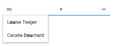
When you start typing into a multi-select tokens control, the list of choices that is displayed, which is filtered, by the text you have typed, now shows the matches in the choice list with the text you have typed in bold.
For example, in the image below, the user has typed 'ou'. The choice list shows all of the items that contain the string 'ou'. Notice that in the choice list, all instances of the string 'ou' are highlighted:
Inserting an Add-in Control
Add-in Controls are inserted using the More... option in the Data Controls section of the UX Builder.
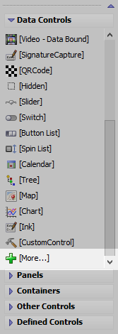
Select the control you would like to add and click OK.
In addition to the controls that ship with Alpha Anywhere, you can also create your own add-in controls. See How to Create Add-in Controls to learn more.
Videos
Adding a Multi-select Tokens Control to a UX Component
The Multi-select Tokens control operates much like the Gmail app when you address an e-mail to multiple recipients. You can type values into a control, or make selections from a drop-down choice list. Each selection is shown in the control as a 'token'. Tokens can be removed from the list of selections by either hitting the backspace key while focus is in the control, or by clicking on the 'delete' icon in the token.
A common use case for the Multi-select Tokens control is to define selection criteria for a List control. In this video we show how a Multi-select Tokens control is used to select a list of countries. The List control is then filtered to show the countries that match the selected tokens. For example, if tokens for 'USA' and 'UK' are selected, the List is filtered to show customers in either 'USA' or 'UK'